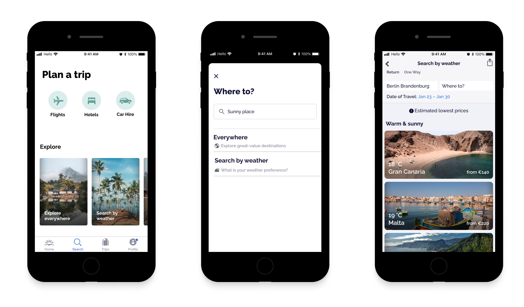
Preview

Project Overview

MY ROLE Team Duration
UX Research, UI Design, Prototyping Solo 1 week (January 2022)

The Product

Skyscanner is one of the biggest travel metasearch engines. It compares and shows flights, hotels and car hire deals from different booking channels across the internet, and helps you find best prices.

The Problem

The weather is a single factor that determines the success of every trip.
There are typically two ways of how we approach the subject of weather when planning trips:

Case 1: A destination has already been defined or booked (e.g. business travel). We check the weather forecast for our destination before we leave to ensure we are packing approriate clothes.

Case 2: We choose a destination based on specific weather conditions or climates we desire(e.g. leisure travel). Here is the problem: Planning trips can feel like hard work. It's a time-consuming process to look through different booking channels and search engines to find the deals that meet our criteria.
In the latter case, the planning process can even get more tedious until we finally book a trip as we additionally have to search through each weather forecast of different destinations at the same time.

“How might we add to one of the already existing and highly adopted travel search apps a new search functionality that helps users search for cheap, last-minute flights based on the weather?”

Problem Discovery

Guerrilla Research

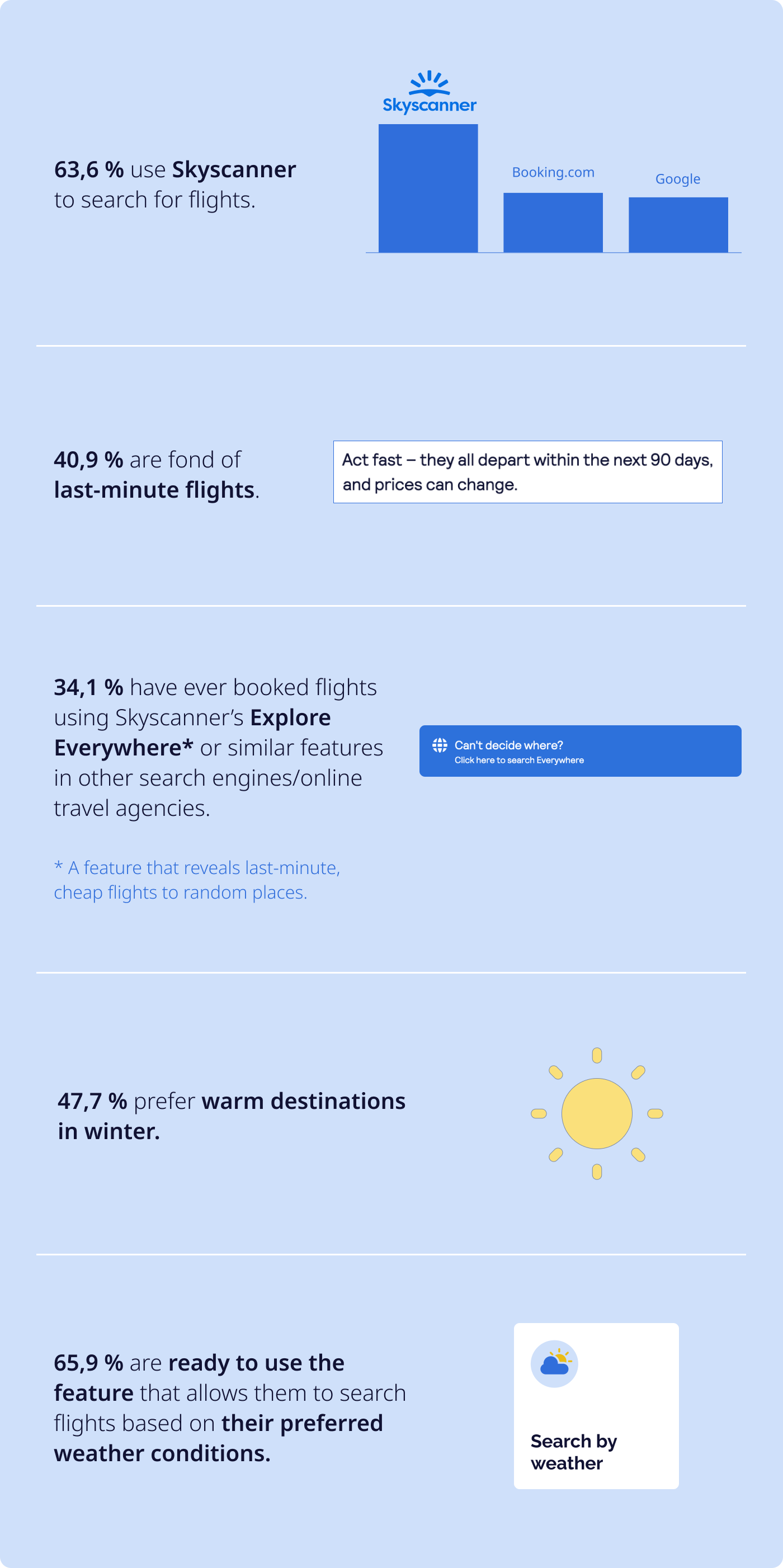
→ I conducted a short survey to quickly learn about the users and the desirability of the new feature. Survey Insights

(44 survey responses in total)

Problem Definition

User Persona

User Persona

Problem & Hypothesis Statement

Skyscanner helps travel-seekers find the best deals on flights, hotels and rental cars by enabling them to compare important factors such as prices and reviews.

The weather also plays a huge role in destination decision-making and planning. However, Skyscanner doesn’t offer the function that lets users to narrow the search results based on their preferred weather conditions which makes them spend extra time on figuring out the weather outlook of different places themselves.

How might we expand the search functionality by integrating the factor ‘weather’ so that travel planning becomes more efficient?

This will improve user satisfaction and increase the number of fully completed bookings.

Ideation

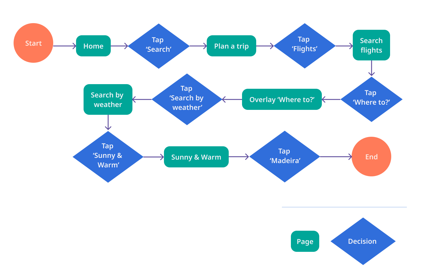
Miguel’s User Flow

User Flow

Mid-Fi Prototype

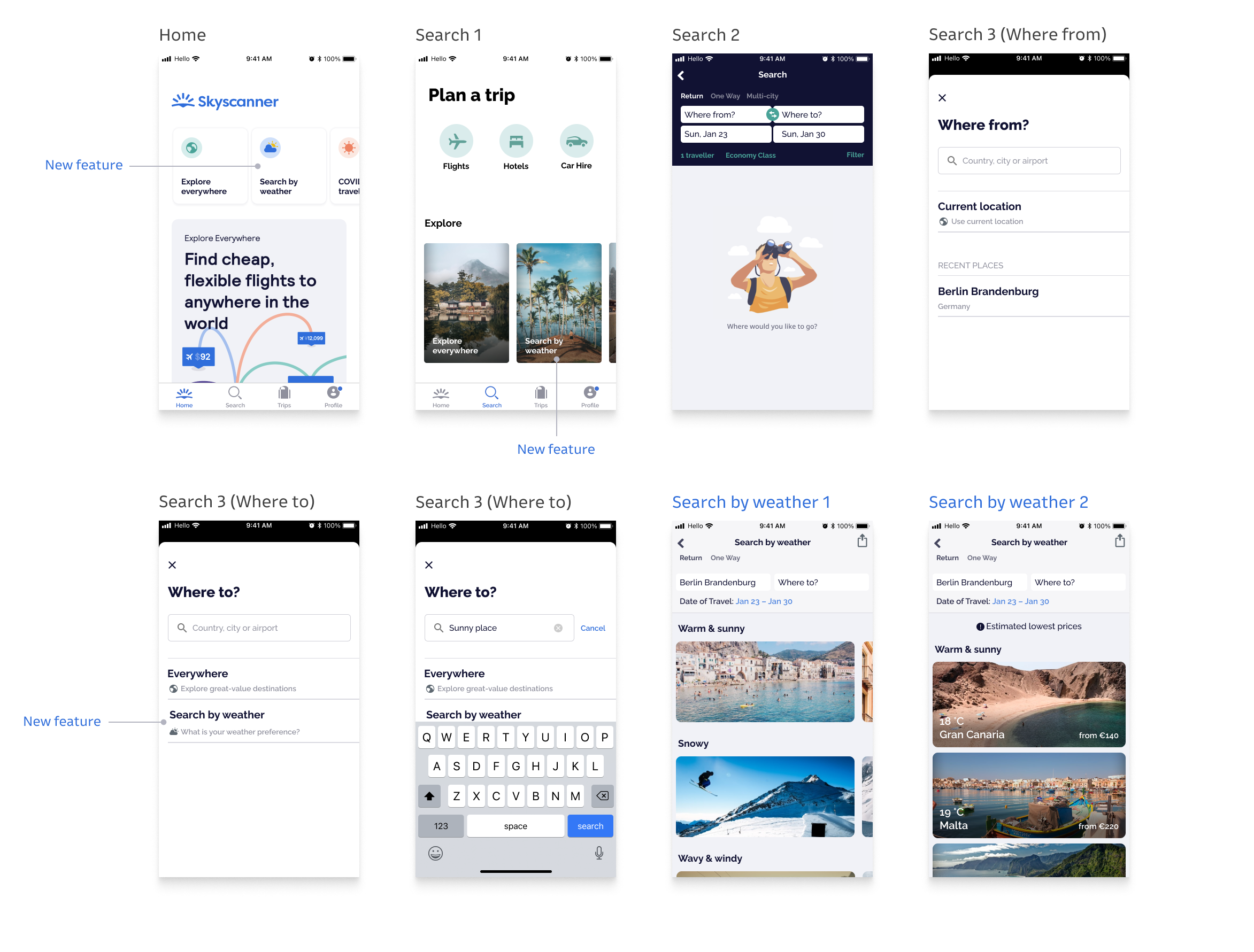
→ How should the new functionality tie into the navigation and search experience of the app?
1. Alignment according to level of importance, repetition, proximity: I made it findable and identifiable by aligning it with the ‘Explore Everywhere’ feature which serves a similar purpose.
2. Display of the search results in weather groups

Mid-Fi Prototype 2 – After a few iterations

→ What has improved?
1. The users can type keywords such as “sunny place” in the “where to?” box. This can help them get the results faster.
2. The layout of the images is adjusted to better fit the app’s commonly used grid.
3. Price blocks are added over the images because the users want to see and compare the prices while scrolling through the results.
Mid-Fi

Hi-Fi Prototype

→ The brand already has an established aesthetic and defined look and feel. How can I maintain this in the hi-fi prototype?
Here is one set of the variations I created and iterated:
Hi-Fi

High-Fi Interactive Prototype

Next steps

1. Create a popup notification which informs the user about the new function. Make sure that this popup appears to the right users and at the right time in their user journey (targets & triggers).

2. Test with 2-3 more users.